Bathroom Design Mistakes
It's not easy going back when you've completed a modern bathroom design. After pipes are laid and walls are tiled, you can't simply rearrange the furniture if you think the layout isn't quite right or you picked the wrong basin. Nor do you want to live with that niggle you didn't nail it every time you use the space! Any mistakes are likely to be costly and inconvenient to alter so it's vital to get your bathroom design right first time.
We talked to six designers who share their advice on planning a modern bathroom, from tips on maximising bathroom storage to getting the lighting scheme just right. So read on and make sure you're clued up on the common bathroom mistakes and their most stylish solutions.
Mix up the tile designs
People often think they have to stick to the same bathroom tiles for the floors and walls in their bathrooms, and whilst this can create a lovely look in a space, it is by no means the tiling rule! Mixing textures, styles, sizes and patterns doesn't mean the room will look mismatched. It's all about picking the correct shades and tones to complement the look you're trying to achieve.
As designers, we frequently mix and match different suppliers too, so don't feel like you have to keep to the same family or range of tiles either! In this bathroom, the clients wanted an industrial feel. Mixing the wood effect with the concrete helped to soften the space, and also create that beautiful feature wall as you walk into the room. The marble effect floor tiles act as an accent to the standout wood tiles and help to lighten the overall scheme.
The illuminated recess gave some very practical in-shower storage, and also helped to add another level of depth and interest to the feature tiling. Keeping the fittings in the space minimal and in the same black finish made the scheme feel sleek and harmonious. Softening the basin area with the darker wood in a similar tone to the wall helped to tie this look together, creating the calming industrial shower room the clients had dreamed of.
Helen Jones, designer, Ripples Bathrooms
(Image credit: Ripples bathroom design)
Plan in plenty of storage
Many people don't think enough about bathroom storage. When you're investing in a bathroom, it's a shame to spoil the look with the clutter of lotions and potions. Even in a small space, ample storage will ultimately mean a more organised room with clean lines. Choose wall-mounted storage solutions to keep the floor clear and aid a spacious feel. If space allows, consider a piece of vintage furniture like a tallboy or credenza, which will add character to the room.
Caddies are also a great idea, as they can be moved around and tucked away into un-utilised spaces. Storage shouldn't be an afterthought so plan it within the studwork and consider building out the walls – recessing niches above the bath or WC and mirrored cabinets within the walls. Think about what you need to have where – for example, recessed shelving is useful for toiletries in the shower and a ladder shelving unit is handy for towels by the bath.
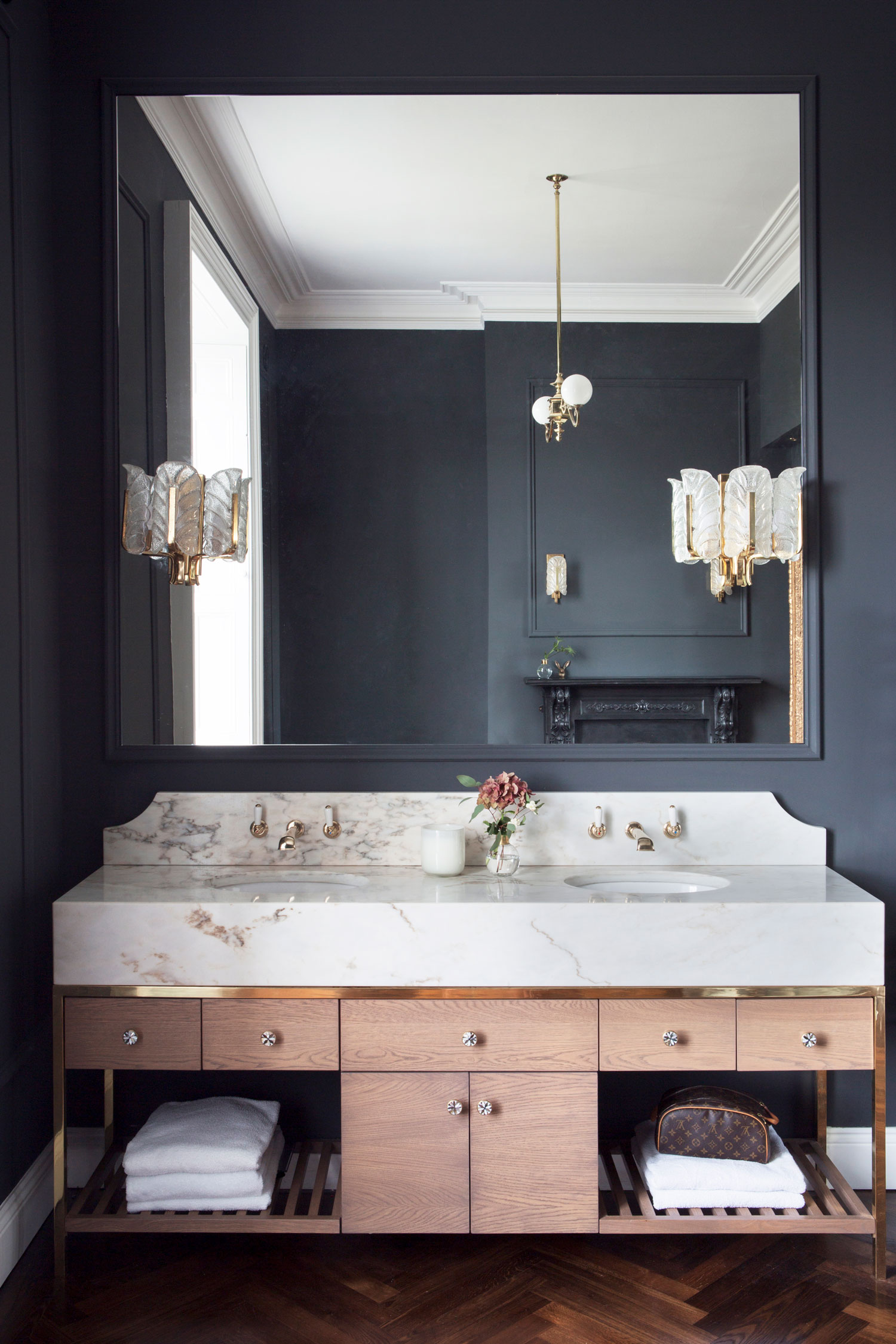
We always try to include a vanity, which is both stylish and practical. Consider a bespoke vanity or cabinet to maximise space, especially in awkwardly shaped rooms. This double vanity in oak, brass and gold calacatta marble from a recent project was a statement piece and stores plenty! We've also designed mirrored vanities in past projects, which not only hide the clutter but increase the sense of light and space in the bathroom – a win-win!
Suzie McAdam, Suzie McAdam Design & The Design Seeker Showroom
(Image credit: Suzie McAdam)
Don't forget the glamour
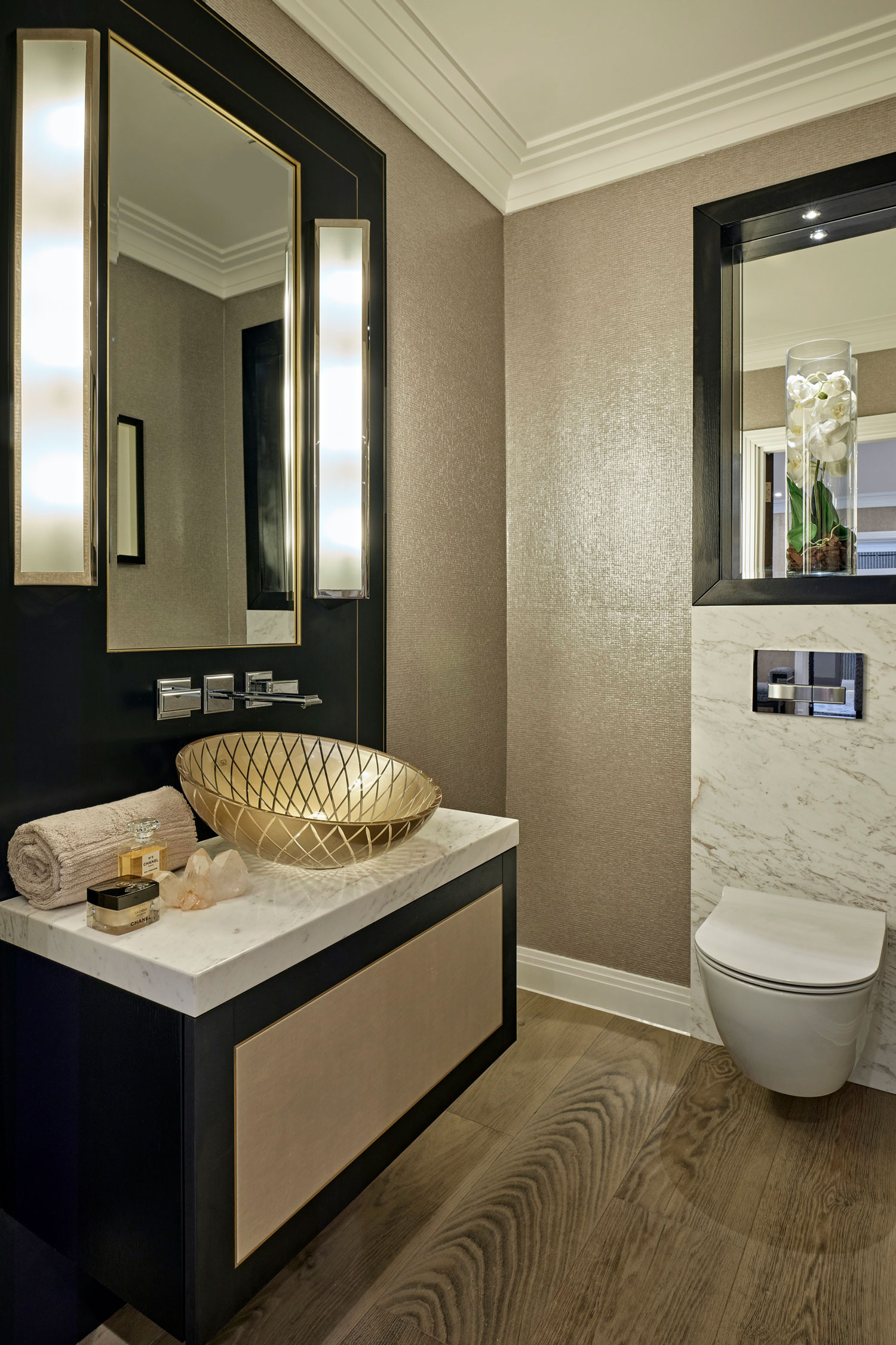
So many bathrooms and powder rooms feel uninspiring but a cloakroom is one place to really bring in the wow-factor. We use a spectrum of sumptuous finishes and textures for a softer aesthetic. Here, smooth polished marble combines with iridescent Élitis metallic wallpaper. It looks special and adds sparkle – who doesn't want to feel totally indulged, every single day?
To up the glamour, make the vanity the focal point. We teamed a grande Art Deco-inspired floating drawer unit with a Xeni basin made from etched glass. It creates theatrical highlights and shadows and is as much a piece of art as it is a place to wash your hands! Then we use lighting to add drama and ambience, perhaps concealing low-level lighting to wash light onto floors, and always using wall lights such as these Geneva sconces within our vanity areas.
To continue the luxurious ambience we might add wall art or seating, and like to install underfloor heating – there's nothing like the cosseted feeling of warm flooring greeting bare feet on a cold morning. And to ensure that the scheme retains its glamour, it must have plenty of storage, which is why we put so much thought into our bespoke vanity units. Don't forget areas for display either – here we designed an aperture above the WC to house an orchid, elegantly in-lit to draw the eye and create a welcoming scene as you enter.
Jenny Weiss, Hill House Interiors
(Image credit: Hill House Interiors)
Push the boundaries
A common mistake I see with small rooms is playing it too safe when it comes to style. You can choose bold designs but plan the scheme around them so there isn't too much going on, and of course, don't forget the basics like storage or your room will soon end up looking cluttered.
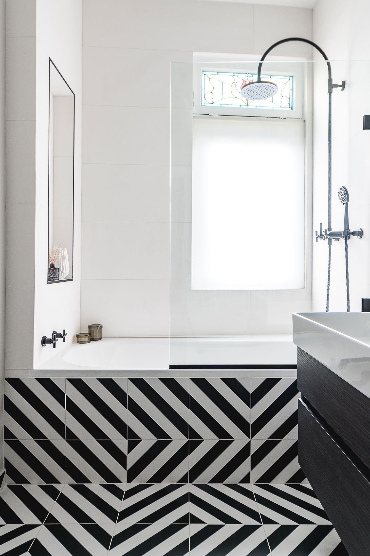
In this family bathroom, we wanted to create a fun and playful scheme so we opted for a monochromatic interior. The floor and black fittings make a statement but are balanced by a light wall colour and lighter tiles on the walls, so the space still feels roomy. With the patterned floor, we were mindful to reduce all other unnecessary visual clutter, choosing a minimal-style bath screen and clean-lined sanitary ware.
To create flow, we randomly laid black and white linear tiles and tiled up the side of the bath to draw the eye in and up to create length. We opted for wall-hung furniture to free up the available floor space and to make the room feel larger. Recessed shelves were embedded in the shower area – ideal for clearing everyday bathing products from view – and we added a large bathroom mirror to bounce light around the room and to make the room appear spacious."
Hayley Robson, creative director, Day True
(Image credit: Day True bathroom design)
You needn't stick to standard sanitary ware
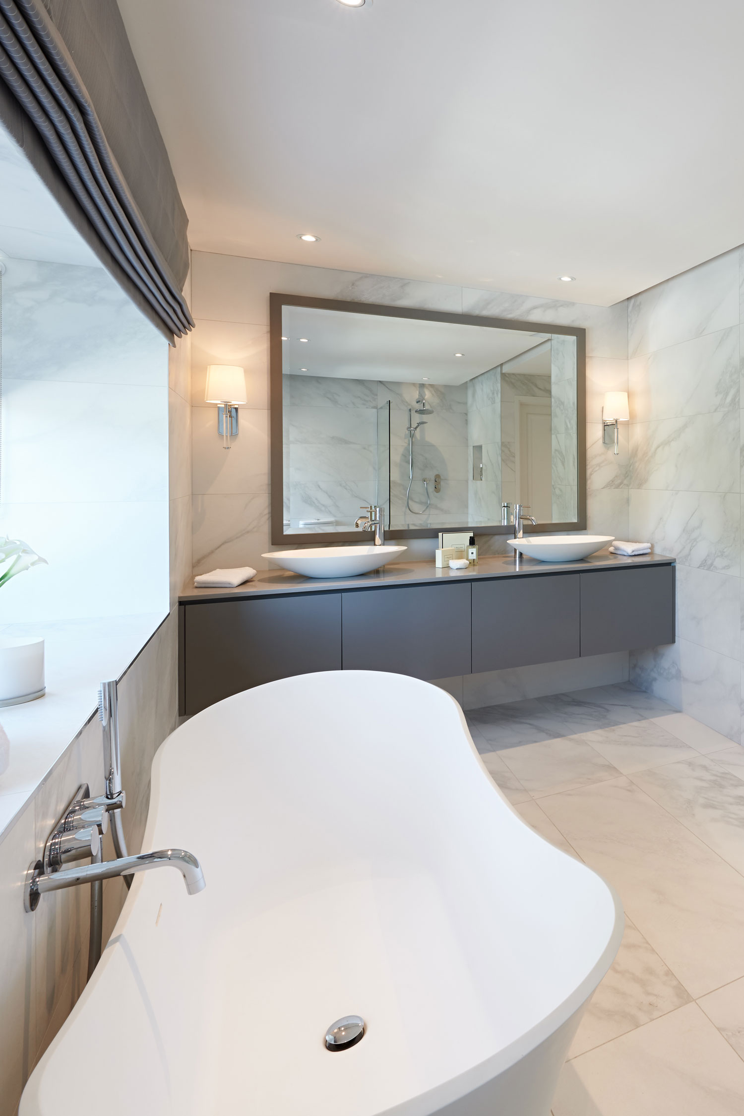
Homeowners often renovate their bathrooms and simply replace a built-in rectangular bath with another. They're nervous to embrace new shapes and colours of sanitary ware, and instead stick to what they know. But if space allows, I like to consider bringing the design away from the walls and choosing a statement tub. In this home, the homeowners wanted to create a bathroom they could share. To accomplish this, we introduced the luxurious slipper bath, a walk-in shower and a bespoke vanity unit with two softly curved basins.
When planning a bathroom layout with a freestanding tub, think about positioning it centrally below a window, below a panel of statement stone or feature tiles, and ensure that there is space around it to allow the design to flow. Even if your room is compact, you may have space for a standout vanity unit with a countertop bowl.
I personally prefer not to see the toilet when you first enter a bathroom and instead try to position something beautiful to catch your eye – nicely designed sinks with mirrors and/or wall lights make an uplifting choice, along with a luxurious shower or bath setting. Always keep in mind that there are solutions to any space once you dare to break from the norm!
Arlene McIntyre, creative director, Ventura Design
(Image credit: Ventura Design bathroom)
Get the lighting right
Often bathroom lighting isn't well-considered. Bathrooms need to serve as both a space to relax in and get ready in, so it's key to get the lighting correct for the different functions, as well as to think about the times of day people will use the space. This can be achieved by balancing task, mood and aesthetic lighting.
For task lighting, we incorporate vanity lights to give people the best possible illumination near mirrors. For mood lighting, we often conceal a light behind a mirror which gives a soft glow around it. You want to be able to change the ambience of the room so we always incorporate dimmer switches in our bathroom lighting schemes and often use ceiling lights to help with this.
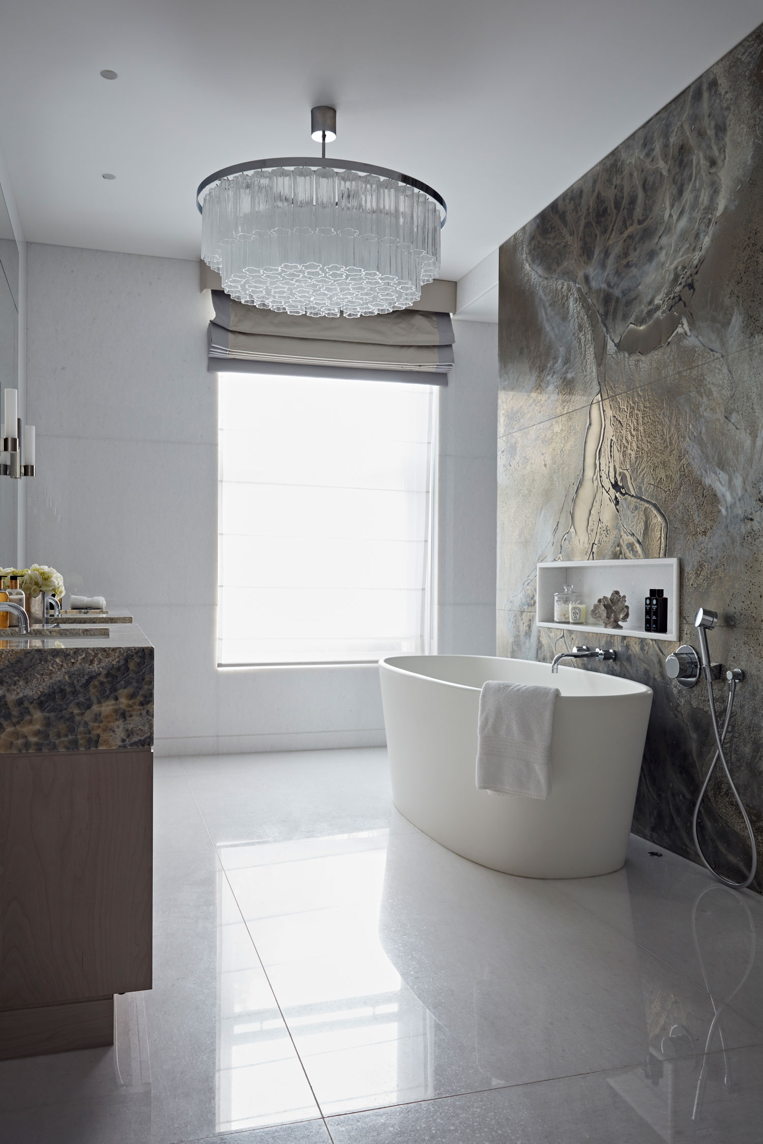
Finally, we add decorative lighting such as a chandelier to create a wow-factor. When designing this bathroom, we used soft lighting to reflect off the poured bronze/stone panel to enhance it and create an environment for unwinding. Spotlights for task lighting are layered with wall lamps for gentler light for make-up, a chandelier for the aesthetics and we also added soft lighting in the niche on the feature wall so in the evenings you can dim the chandelier and have the niche LEDs glowing in the background.
Tabitha Pethick-Money, senior designer and associate director, Taylor Howes
(Image credit: Taylor Howes bathroom design)
What's the first thing to think about when planning a bathroom redesign?
Before the exciting part, discovering styles and colours you love, remember that in a bathroom renovation the balance sheet comes before the mood board! Setting a realistic budget will help prioritise your needs and wants, and will also determine elements of the next steps – space-planning and style selection. Your figure needn't be set in stone but it's wise to have an idea so you can work out where to make savings if you want to make a splurge.
What's the simplest way to increase storage in a small bathroom?
For the roomiest option, switch out your basin for one with a vanity unit with storage drawers, but if you don't want to call a plumber then replace your over-basin mirror with a mirrored cabinet with plenty of internal shelves. If toiletries are still taking over, contain them in a full-length mirrored cabinet like the HiB Eris 30 Tall; it's super-slimline but could be sunk into the wall.
How to use wallpaper in a bathroom?
Wallpaper is easy to update and is perfect for adding personality to your bathroom with pattern, colour, texture or sparkle, yet it's often overlooked as a decorating option. But bathroom wallpaper can be used in a bathroom provided that it's not in an area likely to get splashed and it's a vinyl type specifically for high-humidity areas or is sealed properly with a varnish such as Polyvine. Use a mould-proof paste and make sure the room is always well ventilated.
Source: https://www.livingetc.com/advice/bathroom-design-architects-and-designers-reveal-the-six-biggest-mistakes-people-make


Tidak ada komentar:
Posting Komentar